10 Reasons First-Time Visitors Don’t Give at Your Church (and How to Fix Each One)
Your visitors aren’t stingy, they’re stuck. Most first-time guests would gladly give if the process didn’t work against them. Here are the ten barriers standing between your visitors and their first gift, with practical fixes for every single one.
See your church's plate and price in 30 seconds
Design it yourself on the next page. From $3.50 per plate, free shipping, no monthly fees.
Fewer than 5% of first-time visitors give during their initial visit to a church. That number should stop every pastor and church leader in their tracks, not because visitors are ungenerous, but because it reveals just how many obstacles we unknowingly place between people and their desire to participate.
As a pastor, I’ve watched this play out hundreds of times. A visitor is moved by the worship, connected to the message, and genuinely wants to give. Then the offering moment arrives, and it falls flat. Not because the heart wasn’t willing, but because the process wasn’t ready for them.
The good news? Every one of these barriers is fixable. Some require a technology change. Some require a culture shift. Most require both. Let’s walk through all ten, and what you can do about each one starting this Sunday.
1. They Don’t Know Where to Give
This is the most fundamental barrier, and the one churches most often overlook. Your regular members know exactly how giving works at your church. They know the app name, the text-to-give number, the website URL, or where to find an envelope. Visitors know none of this. They’re walking in cold, and when the offering moment arrives, they have zero context for how to participate.
Think about it from a visitor’s perspective: the pastor says “let’s give,” and suddenly everyone around them seems to know what to do. Some people pull out their phones. Others drop something in a bucket. The visitor glances around, doesn’t see any clear instructions, and the moment passes. They weren’t unwilling, they were simply uninformed.
The Fix
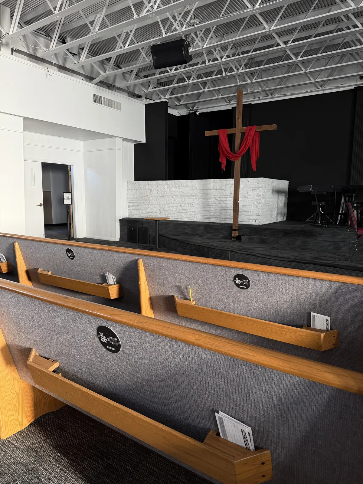
Make giving options physically visible during the service. This means more than a slide on a screen. Consider NFC tap-to-give plates mounted on pew backs or chair arms, they serve as both the giving mechanism and the visual cue. When a visitor sees a plate that says “Tap to Give,” they instantly understand what to do without needing any prior knowledge.
If you use passed plates, make sure they reach every row, including the back, where visitors tend to sit. Add clear signage at eye level with simple instructions. The goal is that no visitor should ever have to search for how to give.
2. They Don’t Want to Download an App
Many churches have invested heavily in giving apps, and for regular members, those apps work well. But for first-time visitors, an app is a non-starter. Downloading an app requires finding it in the app store, waiting for the download, creating an account, entering payment information, and navigating an unfamiliar interface. That’s five or six steps before they can give a single dollar.
Put yourself in their shoes: you’re visiting a coffee shop for the first time, and they ask you to download their app before you can pay. You’d walk out. The same psychology applies at church, except the visitor is too polite to leave. They just quietly opt out of participating, and you never know the difference.
App Giving for Visitors
- Find the right app in the app store
- Wait for download and installation
- Create an account with email and password
- Enter payment information manually
- Navigate unfamiliar interface to find “Give”
Time: 3–5 minutes (if they finish at all)
NFC Tap Giving for Visitors
- Tap phone on the plate
- Giving page opens in browser automatically
- Enter amount and tap to pay
Time: under 10 seconds
The Fix
Offer at least one giving method that requires zero downloads and zero account creation. NFC tap plates are the simplest option, a visitor taps their phone, and their browser opens directly to your giving page. No app store, no login, no friction. For a deeper look at why app-free giving outperforms, see our guide on church giving without an app.
3. They Didn’t Bring Cash or a Checkbook
This one seems obvious, but it’s worth stating plainly because many churches still treat cash as a primary giving method. Roughly 73% of Americans carry little or no cash on a regular basis. For adults under 40, that number is even higher. The checkbook? It’s essentially extinct for anyone born after 1985.
When a church passes an offering bucket and the only visible option is cash, it sends an unintentional signal to the 60% of churchgoers who prefer to give digitally: this moment isn’t for you. The visitor who left their wallet in the car, or who hasn’t carried cash in months, simply watches the bucket go by. The generous impulse dies, and it rarely gets revived later in the week when they’re scrolling through their to-do list.
The Fix
Meet people where they already are: on their phones. Every visitor walks in with a smartphone in their pocket. That phone has Apple Pay, Google Pay, saved credit cards, and a browser that can open a giving page in under a second. NFC tap plates turn that phone into a giving tool without asking the visitor to do anything different from how they already pay for everything else in their life.
Churches that add tap-to-give alongside traditional methods see an average 300%+ increase in giving participation, not because people suddenly become more generous, but because the people who were already generous finally have a way to act on it.
4. The Giving Moment Feels Awkward or Pressured
Here’s an uncomfortable truth: for many visitors, the offering moment is the most stressful part of the service. A plate or bucket is passed down the row, and everyone can see whether you put something in. If you’re visiting and you don’t have cash, you’re essentially sitting there empty-handed while the plate moves past you. It feels conspicuous. It feels judged, even if no one is actually judging.
This is especially acute for younger visitors. Millennials and Gen Z have been vocal about disliking anything that feels transactional or performative in a worship setting. A traditional offering moment, with its formal announcement, slow plate pass, and public visibility, can trigger every one of those concerns simultaneously.
The Fix
Transform the offering from a public spotlight into a personal, private moment. NFC plates change the dynamic completely: when the plate comes by, the visitor taps their phone quietly, and the giving page opens on their personal screen. Nobody else sees the amount. Nobody sees whether they gave at all. The act of tapping looks exactly the same whether you’re giving $5 or $500, or just checking what the page looks like.
This removes the social pressure entirely. Visitors can participate at their own comfort level, which paradoxically leads to more giving, not less. Churches using NFC plates report an 81% participation rate during the offering moment, compared to far lower engagement with traditional methods alone.
5. They Don’t Know If They’ll Come Back
This is a legitimate psychological barrier, and it’s one we should respect rather than try to overcome with guilt or pressure. A first-time visitor is still evaluating. They’re asking themselves: Is this my church? Do I belong here? Will I return? Giving money to an organization you’re not sure you’ll ever see again feels like a big ask, because for them, it is.
The mistake many churches make is treating visitor giving as an all-or-nothing proposition. Either the visitor makes a “real” gift, or the offering moment is a wash. But behavioral science tells us something different: even a small act of giving, $5, $10, creates a psychological commitment. Researchers call it the commitment and consistency principle. Once someone gives, they’re 3–5x more likely to return the following week. The size of the gift matters far less than the act of giving.
The Fix
Lower the perceived stakes. In your offering announcement, explicitly welcome small gifts: “Whether it’s $5 or $500, every gift matters.” Make it clear that one-time giving is perfectly fine, no commitment required, no recurring charge assumed. Some churches even add a “First-Time Visitor” or “I’m New Here” fund option on their giving page to signal that occasional giving is expected and welcomed.
When the process is fast and low-pressure, like tapping a phone and entering a small amount, visitors are far more likely to take that first step. And that first step is what starts the journey from visitor to member.
6. The Online Giving Page Is Hard to Find or Confusing
Let’s say a motivated visitor actually pulls out their phone during the offering and tries to find your giving page. What do they encounter? If your church is like many, the visitor Googles your church name, lands on the homepage, scrolls around looking for a “Give” button, and eventually finds it buried in a dropdown menu or footer link. By the time they get there, the offering moment is long over.
Even when they find it, many church giving pages ask for too much information upfront: name, email, phone number, mailing address, all before they can enter a dollar amount. For a first-time visitor who just wants to drop $20, this feels like filling out a tax form. Each additional field is another opportunity for them to close the tab and move on.
Common Giving Page Problems
- “Give” button buried in navigation
- Too many required fields before giving
- Not mobile-optimized (tiny buttons, broken layout)
- Multiple fund options that confuse new visitors
Visitor-Friendly Giving Page
- Opens directly via NFC tap, no searching
- Amount field front and center
- Mobile-first design with large tap targets
- Apple Pay / Google Pay for one-tap checkout
The Fix
Eliminate the “finding” step entirely. NFC tap plates link directly to your giving page, the visitor never has to search, type a URL, or navigate a website. Then audit your giving page itself: make sure it loads fast on mobile, puts the amount field first, supports Apple Pay and Google Pay, and doesn’t require an account to give. Every field you remove increases completion rates. Platforms like Tithely, Pushpay, and Donorbox all support streamlined mobile giving, make sure yours is configured for speed.
7. They Don’t Feel Connected Enough Yet
Giving is an emotional act. People give to causes they feel connected to, organizations they trust, and communities they feel part of. A first-time visitor, no matter how great the service was, hasn’t had time to build that emotional connection yet. They might love the worship, agree with the message, and enjoy the atmosphere, but they haven’t formed the relational bond that typically precedes generosity.
This is natural and healthy. We shouldn’t try to manufacture a false sense of belonging just to drive a transaction. But we can create conditions where visitors feel welcomed enough to participate, even before deep connection forms.
The Fix
Frame giving as participation, not obligation. Instead of “it’s time for tithes and offerings”, language that implies a duty reserved for members, try something like: “Whether you’ve been part of this church for twenty years or you’re joining us for the first time today, this is your chance to be part of what God is doing here.”
Share a brief, compelling story before the offering about how giving impacts your community. A 30-second testimony about how the food pantry served 50 families last month does more to motivate a visitor’s first gift than any theological teaching on tithing. Connect the gift to a tangible outcome, and even first-time visitors will want to be part of it.
8. The Process Takes Too Long
Mobile user behavior research is clear: if a process takes more than about 10 seconds, most people abandon it. For first-time visitors who have no emotional investment in completing the process, that window is even shorter. They’re not going to spend 90 seconds navigating a clunky mobile giving form while the sermon starts around them.
This is where many well-intentioned digital giving solutions fail. Text-to-give requires typing a number, sending a keyword, receiving a link, opening a page, and then entering payment info. QR codes require opening the camera, scanning, waiting for the link to load, and then going through the same form. By comparison, NFC is shown to be 42x more effective than QR codes for engagement, because the interaction is instantaneous.
The Fix
Count the seconds. Time yourself going from “I want to give” to “my gift is submitted” using your current giving method, as if you’ve never done it before. If it takes more than 10 seconds, you’re losing visitors. NFC tap plates get someone to the giving page in about one second. Pair that with a giving platform that supports Apple Pay or Google Pay, and the entire transaction, from tap to confirmation, takes under 10 seconds.
Speed isn’t just a convenience feature. For visitor giving, speed is the feature. The faster the process, the higher the conversion rate.
9. They’re Worried About Recurring Charges or Spam
Trust is fragile with first-time visitors, and understandably so. They’ve heard stories about organizations that make it easy to sign up for recurring charges and hard to cancel. They worry that entering their email means a flood of newsletters. They’re cautious about putting their credit card into an unfamiliar system, and they should be.
This concern is amplified when giving platforms default to “recurring” rather than “one-time” for new gifts. A visitor who intended to give $25 once but accidentally signed up for a monthly charge will feel deceived, and they won’t come back. It only takes one bad experience to poison the well.
The Fix
Default to one-time giving. Make sure your giving platform’s default selection is a one-time gift, not recurring. This is a simple settings change on most platforms (Tithely, Pushpay, Donorbox, and others all allow this). Recurring giving is great for established members, but it should be an opt-in, never a default for new visitors.
During your offering announcement, explicitly say: “This is a simple one-time gift, no recurring charges, no sign-ups.” That one sentence can eliminate the trust barrier for dozens of visitors. Keep your email opt-in separate from the giving flow, and never auto-subscribe donors to mailing lists without their clear consent.
10. Nobody Showed Them How
This is the simplest barrier on the list, and the easiest to fix. Many churches assume that visitors will figure out the giving process on their own. But if you’ve never used NFC, never seen a text-to-give number, or never heard the phrase “tap to give,” you need someone to show you the way. Most visitors won’t ask. They’ll just sit there and watch.
The offering announcement is the single most important moment for visitor giving, and most churches waste it with insider language. “Tithes and offerings” means nothing to a visitor. “You can give online at our website” is vague and unhelpful when someone doesn’t know the website. Even “use our app” assumes the visitor already has it installed.
“If you’d like to give this morning, just tap your phone on the plate when it comes your way, no app needed, no account to set up. It takes about three seconds, and it’s completely private. Whether this is your first Sunday or you’ve been with us for years, we’re grateful for your generosity.”
The Fix
Give a clear, 15-second explanation every single week. Don’t assume anyone knows how your giving works. Use plain, inclusive language that explicitly welcomes visitors. Explain the mechanic (“tap your phone on the plate”), set expectations (“takes about three seconds”), and remove objections (“no app needed, no account to set up”).
Train your ushers to offer the plate to every person in the row, including unfamiliar faces. A warm smile and a brief “just tap your phone right here” from an usher is the most effective giving tutorial a visitor will ever receive.
Remove the Barriers, Unlock the Generosity
Look at these ten reasons together and a pattern emerges: visitors aren’t failing to give because they’re unwilling. They’re failing to give because we’ve built systems that work for insiders and leave newcomers on the outside looking in.
The 10 Barriers at a Glance
The good news is that one solution addresses six of these ten barriers simultaneously. NFC tap-to-give plates make giving visible (#1), app-free (#2), cashless (#3), private (#4), instantly accessible (#6), and fast (#8). The remaining four barriers, uncertainty about returning, emotional connection, fear of recurring charges, and lack of instructions, are solved by how you talk about giving, not just how you enable it.
When you combine the right technology with the right language, something powerful happens. Visitors don’t just give, they participate. They feel included. And research shows that visitors who give during their first visit are 3–5x more likely to return the following week. That first gift isn’t just revenue, it’s the beginning of a relationship.
The Bottom Line
Ready to Remove Every Barrier Between Your Visitors and Their First Gift?
NFC tap-to-give plates start at just $3.50/plate. One-time cost. No monthly fees. No transaction fees. Works with Tithely, Pushpay, Givelify, and any giving platform.
Start a quote to get 10% off for 14 days.
Related Articles
First-Time Visitors to First-Time Givers: The NFC Advantage
How NFC tap plates turn first-time church visitors into first-time givers by removing every friction point.
InsightsChurch Giving Without an App: Why Simpler Wins
Why the simplest giving method often outperforms sophisticated apps, especially for visitors and younger generations.
GuideChurch Giving for Millennials and Gen Z
How to engage younger generations in church giving with the technology and approach they expect.