6 Reasons Your Church’s Online Giving Page Is Losing Donations (and Quick Fixes)
Your giving platform might be great. But if the page itself creates friction, too many fields, slow load times, no mobile optimization, you’re leaving donations on the table. Here are the six most common mistakes and how to fix each one.
See your church's plate and price in 30 seconds
Design it yourself on the next page. From $3.50 per plate, free shipping, no monthly fees.
1. Too Many Fields Before the First Gift
Name. Email. Phone number. Mailing address. Account password. Confirm password. By the time your giving page asks for all of this, most first-time givers have already closed the tab. Research from the Baymard Institute shows that every additional form field loses 10–20% of potential completions. A giving page with eight required fields before someone can enter their card number isn’t thorough, it’s a wall.
Think about it from a visitor’s perspective. They felt moved during the sermon. They want to give. They pull out their phone and land on your giving page. Then they see a form that looks like a job application. The emotional moment passes while they’re typing their zip code. The impulse to give has a shelf life, and long forms kill it.
The information you’re collecting is valuable, but the timing is wrong. You don’t need a mailing address to process a digital gift. You don’t need a phone number to issue a receipt. Collect what you need to complete the transaction now and gather the rest later, through a follow-up email, a profile completion prompt, or your church management system.
Quick Fix
- Reduce first-time giving fields to email, amount, and card details only
- Move name, phone, and address to an optional post-gift profile step
- Enable Apple Pay and Google Pay to skip manual card entry entirely
- Send a follow-up email after the gift asking for additional info
2. No Mobile Optimization
Over 60% of church giving now happens on mobile devices. That number climbs even higher during services, when people are sitting in the pew with their phone in hand. If your giving page was designed for a desktop browser and simply shrinks on a phone, you’re creating friction for the majority of your givers.
Mobile friction shows up in subtle but costly ways. Tiny form fields that require pinch-to-zoom. Buttons too small for a thumb to tap accurately. Dropdowns that don’t play well with mobile keyboards. No auto-fill support, forcing people to manually type their card number on a 6-inch screen. Each of these small irritations adds up, and on mobile, people bail faster than they do on desktop.
The In-Pew Mobile Moment
When someone decides to give during a service, they have about 60–90 seconds of motivation before the moment fades. On a phone, that window is even shorter. If your giving page isn’t built for the device they’re holding, you lose the gift before the sermon ends. NFC tap-to-give plates are designed for exactly this moment, one tap opens a mobile-optimized giving page instantly, no typing or searching required.
Quick Fix
- Test your giving page on an actual phone, not just a browser resize, tap every button with your thumb
- Ensure all tap targets are at least 44x44 pixels (Apple’s minimum)
- Enable autocomplete attributes on form fields so mobile browsers auto-fill name, email, and card
- Use NFC plates to deliver givers directly to a mobile-optimized page, no URL typing needed
3. Forcing Account Creation Before Giving
Requiring account creation before a donation is the single biggest conversion killer on church giving pages. Baymard Institute’s e-commerce research found that forced account creation causes 24% of users to abandon checkout entirely, and that’s for purchases people actively want to make. For a spontaneous act of generosity during a church service, the abandonment rate is even higher.
From the giver’s perspective, creating an account feels like a commitment they didn’t sign up for. They wanted to give $50. Instead, they’re being asked to choose a username, create a password (with at least one uppercase letter, one number, and a special character), verify their email, and then log in, all before they can even see the giving form. That’s not a giving experience. That’s an onboarding flow.
This problem is especially damaging for first-time visitors. A regular member might tolerate creating an account because they plan to give again. But a visitor who felt moved by the service? They don’t know if they’re coming back next week. Asking them to create an account is asking for a relationship commitment before the first date. NFC plates bypass this entirely, a tap opens the giving page directly, no login required, no app to download, no account to create.
Quick Fix
- Enable guest giving as the default option, no account required for a first gift
- Offer account creation after the gift: “Want to save your info for next time?”
- Use NFC plates to send givers directly to the giving page, skipping app downloads and logins
- If your platform requires accounts, switch to one that supports guest checkout (Tithely, Donorbox, Givelify all do)
4. Confusing Fund Designations
General Fund. Building Fund. Missions. Youth Ministry. Benevolence. Women’s Ministry. Men’s Ministry. Parking Lot Repaving. Pastor’s Appreciation. VBS 2026. When someone opens your giving page and sees a dropdown with 12 fund options, the paradox of choice kicks in and many simply don’t choose at all.
Psychologist Barry Schwartz’s research on choice overload applies directly here. When people face too many options, they experience decision paralysis. They don’t pick the “wrong” fund, they pick no fund. They close the page and tell themselves they’ll figure it out later. “Later” rarely comes. The Columbia University jam study famously showed that reducing options from 24 to 6 increased purchases by 10x. Your giving page works the same way.
The bigger issue is that most givers don’t care which fund their money goes to. They trust the church to use it well. The fund dropdown exists for your accounting team, not for the giver. Making everyone navigate your internal chart of accounts before they can give is asking donors to solve a problem that isn’t theirs.
Quick Fix
- Default to General Fund and pre-select it so most givers never have to think about it
- Limit visible fund options to 3–4 maximum, hide the rest behind an “Other” or “More options” link
- Use clear, plain-language names (“General Giving” instead of “Fund 1001 – Operations”)
- Only surface special funds during active campaigns (building fund during a capital campaign, missions during missions month)
5. Slow Page Load Times
Every additional second of page load time drops conversion rates by approximately 7%. That’s not a theoretical number, it comes from Google’s own research on mobile page speed. If your giving page takes 5 seconds to load instead of 2, you’ve lost roughly 20% of givers before they even see the form.
Church giving pages are often slower than they need to be. The giving platform loads its own analytics scripts. The church website adds a chat widget. There’s a video embed in the header. Social media tracking pixels fire on every page. A cookie consent banner loads its own JavaScript bundle. Each of these adds milliseconds, and on a phone connected to the church’s Wi-Fi (which is often shared with 200 other devices), those milliseconds become full seconds.
The worst part? You probably don’t even know your page is slow. You test it on your office computer with a fast connection and it loads fine. But your congregation is testing it on their phones during service, on shared Wi-Fi, while the livestream is eating bandwidth. That’s the real-world condition your giving page needs to perform in.
Quick Fix
- Test with Google PageSpeed Insights, aim for a mobile score above 80
- Remove unnecessary scripts from the giving page: chat widgets, social pixels, video embeds
- Use a dedicated giving URL (e.g., yourchurch.com/give) that loads only the giving form, not your entire website
- Compress images and lazy-load anything below the fold
6. No Clear Path From the Pew to the Page
You’ve optimized your giving page. Three fields. Mobile-friendly. Guest giving enabled. Loads in under two seconds. But here’s the question: how does someone sitting in the third row actually get to that page? If the answer is “we put the URL on a slide” or “it’s in the bulletin,” you have a last-mile problem.
The gap between “I want to give” and “I’m on the giving page” is where most donations die. A URL on a slide means someone has to read it, open their browser, type it correctly (was it /give or /giving or /donate?), and wait for it to load. A QR code is better, but it still requires opening the camera app, framing the code, and tapping the link. Each step is a chance for the giver to get distracted, make an error, or lose motivation.
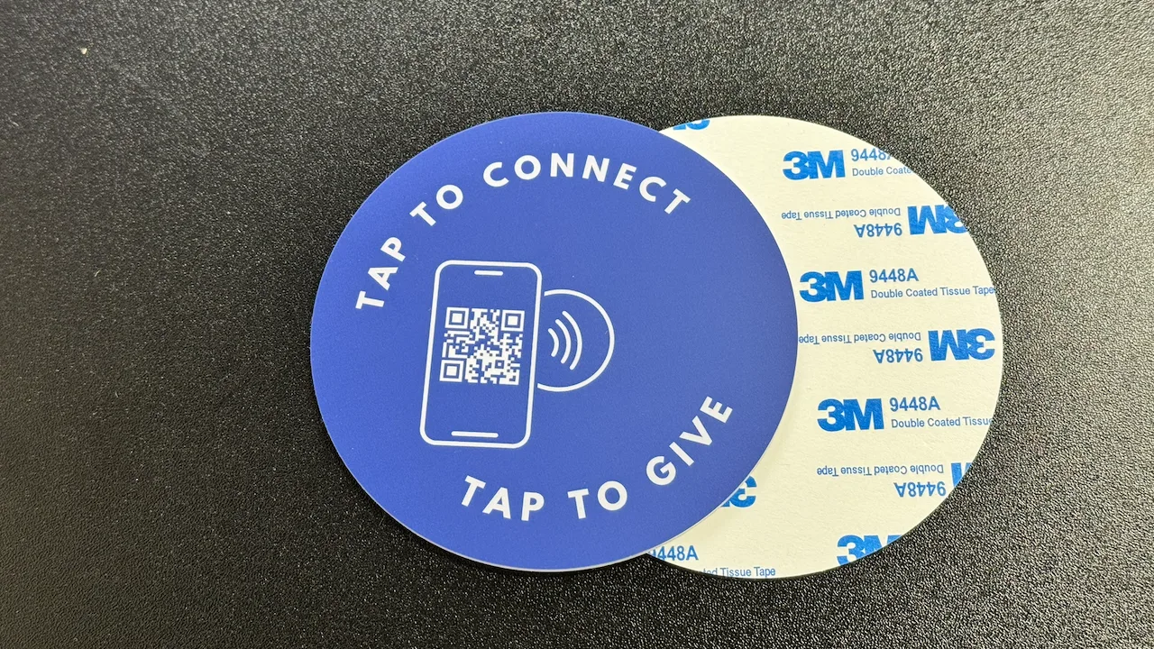
This is where physical NFC plates change the equation. A plate mounted on the pew back or chair in front of every seat means the path from intention to action is one tap. No URL to remember. No camera to open. No app to download. The giver touches their phone to the plate, and their browser opens directly to your giving page. It’s the same gesture they use every day with Apple Pay and Google Pay, familiar, instant, and frictionless.
The data backs this up. NFC generates 42x more engagement than QR codes, and churches using tap-to-give plates report up to 300% increases in donations with 81% congregation participation rates. That’s not because NFC is magic, it’s because removing the gap between the pew and the page removes the single biggest barrier to giving.
Quick Fix
- Install NFC tap-to-give plates on every pew or chair, one-time cost, no monthly fees
- Ensure your plates link to a mobile-optimized giving page with guest checkout enabled
- Announce the plates from the stage: “Just tap your phone on the plate in front of you”
- For seats without pews, use elastic band mounts that attach to chair backs
Giving Page Audit Checklist
Use this checklist to audit your church’s giving page. If you can’t check every box, you’re likely losing donations to preventable friction.
Form & Fields
- First-time giving requires 3 fields or fewer
- Guest giving available (no account required)
- Apple Pay / Google Pay enabled
- General Fund is pre-selected by default
Mobile Experience
- Page is fully responsive on phones
- All buttons are thumb-friendly (44x44px+)
- Autocomplete enabled on form fields
- Tested on an actual phone, not just a browser
Page Performance
- Loads in under 3 seconds on mobile
- PageSpeed Insights mobile score above 80
- No unnecessary scripts on giving page
- Images compressed and lazy-loaded
Pew-to-Page Path
- Physical touchpoint on every seat (NFC plate)
- Giving page reachable in under 5 seconds
- Verbal announcement during service
- Works for visitors with zero setup
Bridge the gap between the pew and your giving page
NFC plates start at $3.50/plate. One-time cost. Free shipping. No monthly fees. Ever.
Start a quote to get 10% off for 14 days your first order
Related Articles
Church Giving Without an App: Why the Simplest Option Wins
51% of people download zero apps per month. Every app-free giving method ranked by friction.
GuideHow to Increase Online Giving at Your Church
Proven strategies to boost digital donations with practical steps any church can implement today.
InsightsFirst-Time Visitors and NFC Giving: Capturing the Moment
53% of NFC givers are first-timers. How tap-to-give turns visitors into givers without any barriers.